mirror of
https://github.com/olehomelchenko/chart-sins.git
synced 2026-08-08 02:22:43 +00:00
 Claude
fd70ccfc13
Claude
fd70ccfc13
Both arrived as real charts before the sins existed, which is the better
order — the specimen makes the failure mode obvious.

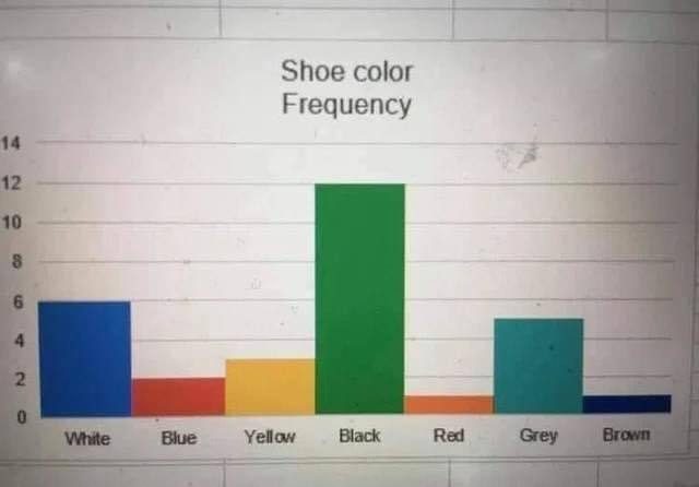
"Bar Colours That Contradict Their Labels" (severity 2): categories that
already own a colour, drawn in a default palette, so Black is a green
bar. Nothing false, which is exactly why it's a 2 under our rubric — but
colour is pre-attentive, so the reader pays the cost on every glance.

"A Colour Scale That Changed Between Two Charts" (severity 4): the
Tagesschau incidence maps, rebinned from 25/50/100/250/500 to
20/35/50/100/200 three weeks apart while being presented as a
before-and-after. A colour key is an axis, and moving it mid-comparison
is the axis crime we don't police because a legend reads as formatting.

The bad chart there needed an explicit independent colour resolve —
Vega-Lite merges scales across a concat by default, which silently
unified the two legends and destroyed the entire demonstration.

Co-Authored-By: Claude Opus 5 <noreply@anthropic.com>
Claude-Session: https://claude.ai/code/session_01ULE5RRxdQE1ebwefEd2eCM
19 KiB
640x446px
19 KiB
640x446px