Note: If using Google Drive, make sure to enable external access to your video!
Introduction
[Write your portfolio theme here (3-5 sentences). Explain what unifying theme connects your visualizations.
What overarching question are you exploring? Why did you choose
this topic? How do your 5+ visualizations work together to tell
a complete story?]
1. [Descriptive Title of Your Visualization]
Context & Question
[What analytical question does this address? Why is it important?]
Design Decisions
[Chart type rationale, visual encodings, alternatives considered, tradeoffs]
Key Insights
[Patterns, trends, outliers discovered. What viewers should take away.]
2. [Title of Your Second Visualization]
Context & Question
[What question does this visualization address?]
Design Decisions
[Explain your design choices. Why did you choose this chart type?
What visual encodings did you use? What interactive features
did you include and why?]
Key Insights
[What did you discover?]
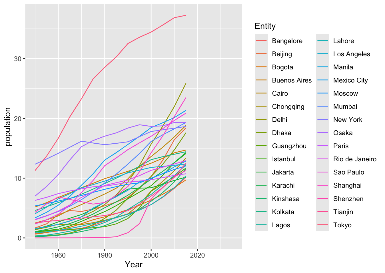
3. Using External Libraries: R + ggplot2 Example
Context & Question
This example demonstrates how to use external visualization libraries
like R's ggplot2. You can create visualizations in your preferred
tool/language, export them as images, and include them in your portfolio.
Design Decisions
This visualization was created using R and the ggplot2 library,
a powerful tool for creating publication-quality graphics. The code
loads city population data and creates a line chart showing population
trends over time for different cities. After creating the visualization
in R, it was exported as a PNG image and included in the portfolio.
📝 Click to view R code
install.packages("ggplot2")
library(ggplot2)

data <- read.csv('assets/city-population.csv')

ggplot(data, aes(x = Year, y = population,
                 color = Entity)) + geom_line()
Key Insights
[When using your own data: Describe the patterns, trends, or outliers
you discovered. What should viewers take away from this visualization?]
4. [Title of Your Visualization]
Context & Question
[What question does this visualization address?]
Design Decisions
[Explain your design choices. What tool did you use
to create this? Why this visualization approach?]
Key Insights
[What did you discover?]
5. [Title of Your Fifth Visualization]
Context & Question
[Your text here]
Design Decisions
[Your text here]
Add your visualization here
Copy one of the templates above (Vega-Lite, Tableau, R/Python, or Image)
Key Insights
[Your text here]
6. [Title of Your Sixth Visualization]
Context & Question
[Your text here]
Design Decisions
[Your text here]
Add your visualization here
Key Insights
[Your text here]
Reflection
[OPTIONAL: What did you learn through creating this portfolio?
How did your understanding of data visualization principles evolve?
What challenges did you face and how did you overcome them? What
would you do differently next time?]
AI Usage Documentation
[IF YOU USED AI: Document what you used it for and include shared conversation links or PDFs.
Create an AI_Documentation folder in your ZIP with these files.
IF YOU DID NOT USE AI: Delete this entire AI Usage Documentation section.]
Remember: All AI usage must be documented. Include links to shared conversations
or PDF exports in a folder called AI_Documentation in your ZIP archive.

![[Brief description of visualization]]([your-image-filename.png])